
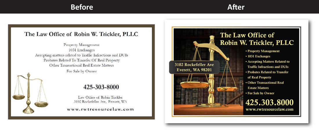
I created this ad for a lawyer located in Everett, Washington. His old ad needed to be revised so that it would be more eye-catching in a newsletter. I put my design knowledge and skills to good use in order to create an ad that would help him stand out from the competition.
Provided below are the design principles and techniques I used to redesign this ad.
Hierarchy
What is hierarchy? A hierarchy is an organization of items into different levels of relative importance.
In the revised ad, my goal was to first draw attention to the business name: The Law Office of Robin W. Trickler, PLLC,. It was especially important to add emphasis to the name since it communicates to an audience that this is an ad for legal services. Hierarchy of the business name was achieved through it's placement in the ad (at the top), the increased text size and the use of high-contrasting colors.
Order & Improving Readability
To achieve order and to improve readability, the list of offered services, phone number & website was arranged in one column under the business name. In addition, bullet points were placed to the left of the offered services so people can easily differentiate each one. The alignment of all the text with the 'Scales of Justice' image also helped to achieve order throughout the ad.
Consistency
Color: The revised ad uses the same color palette throughout: gold for the text and black for the background. If you are creating an ad without a pre-defined color palette, try taking color from an image. In this case, I used the color picker tool to select the gold color from the 'Scales of Justice' image.
Font: I also used the same font throughout the ad. A serif font was chosen because I felt that it was professional-looking and appropriate for a law office. NOTE: Ads can also have a 2nd font, but any more than that and it will start to look cluttered.
High-Resolution Imagery
Always use high-resolution images! Low-quality images tend to be blurry and even blocky in some parts. High-resolution images have crisp, clean and clear lines, which is why they are perfect for print advertisements. Also, stay away from clip art as they tend to look unprofessional.

 RSS Feed