
Using Match Color in photoshop is very useful when you are making a photo composite and you want the different photos to have the same color scheme. In this tutorial, I'm going to show you, in a few easy steps, how to do just that!
I decided to make this tutorial after completing a photo composite project for a client in Florida, who is creating a comic book with a Greek mythology theme. Once he finished photographing the model (who represents the Greek god Hades), he emailed me the photos, along with a background photo, and I got to work on creating the composite.
Note: Click on each image below to view larger size.
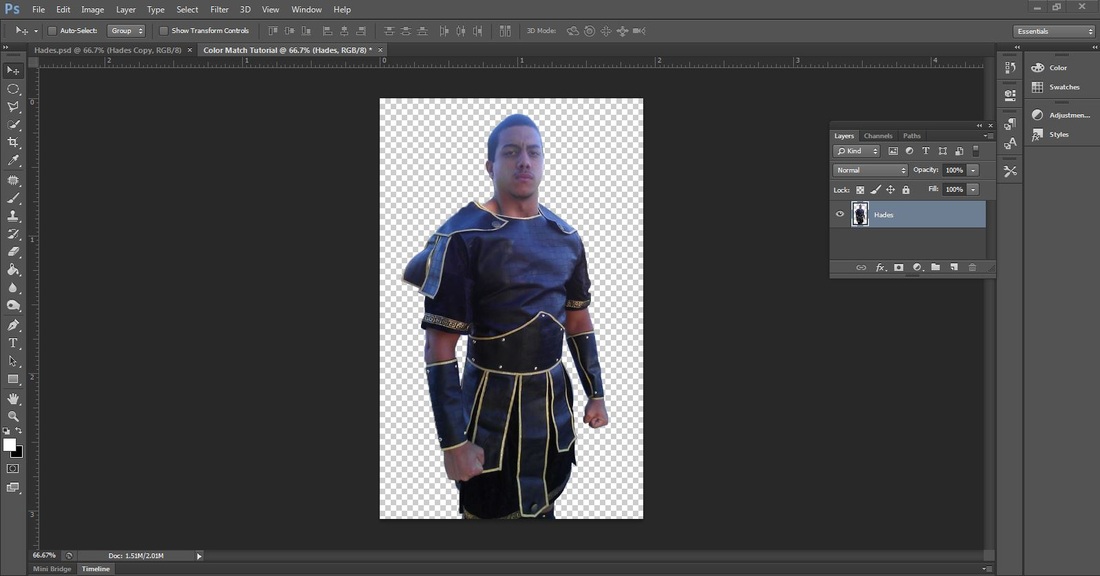
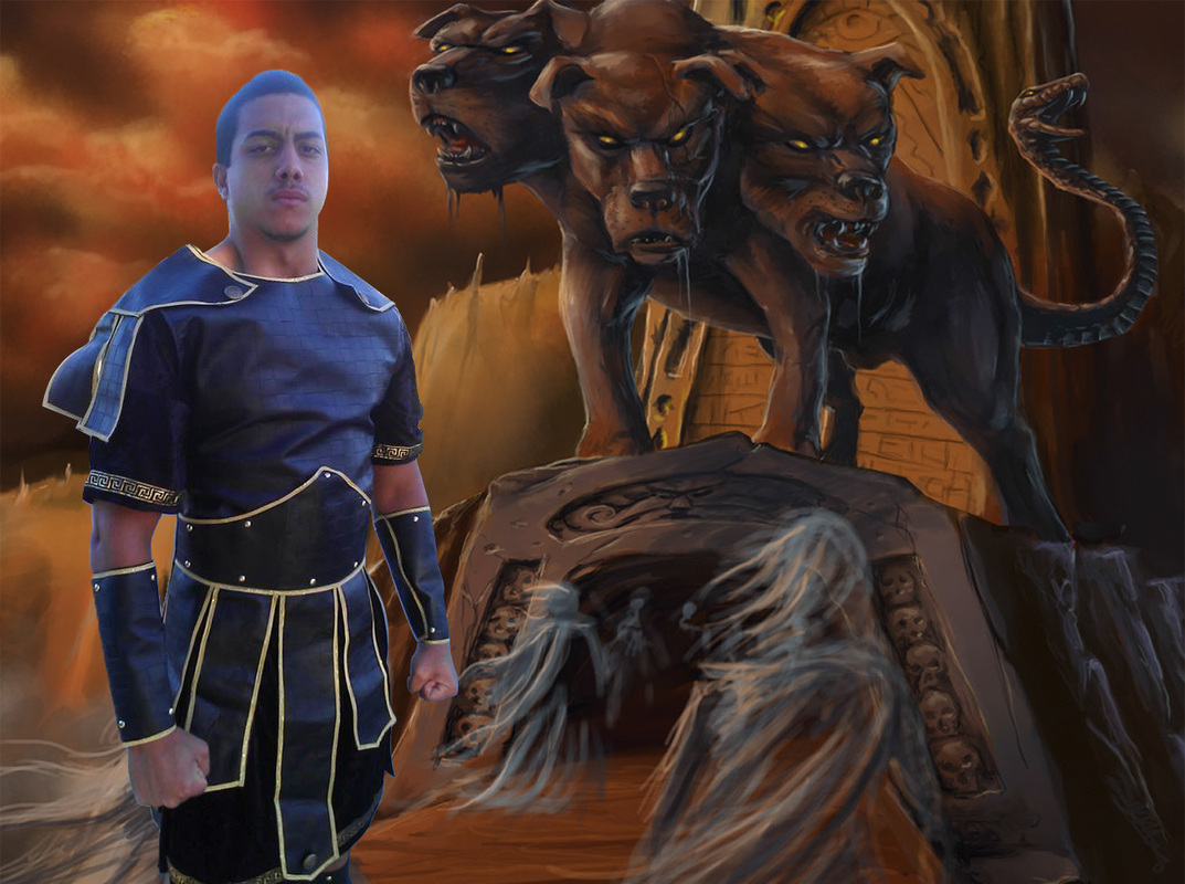
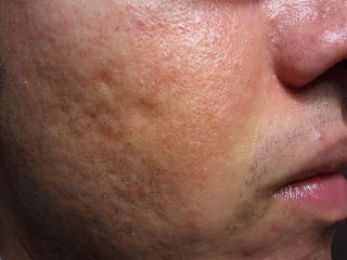
Step 1. Open an image you want to edit in photoshop (File>Open). In this image, the model was photographed outside on a sunny day, which is why a blue color cast appears on his hair, skin, and costume.
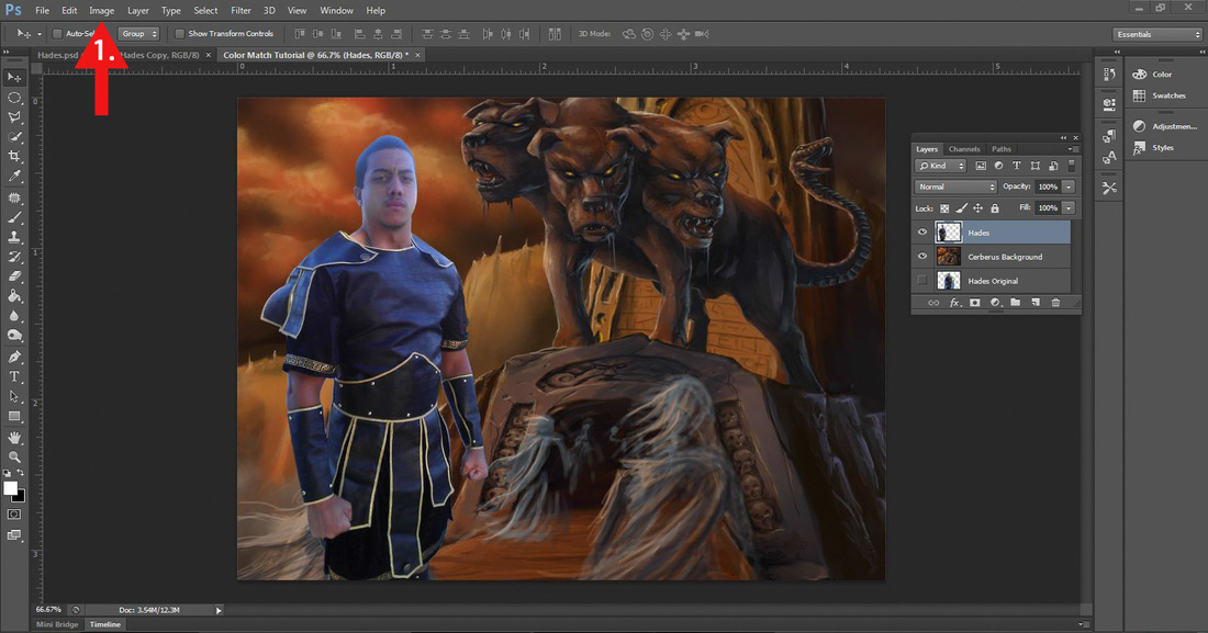
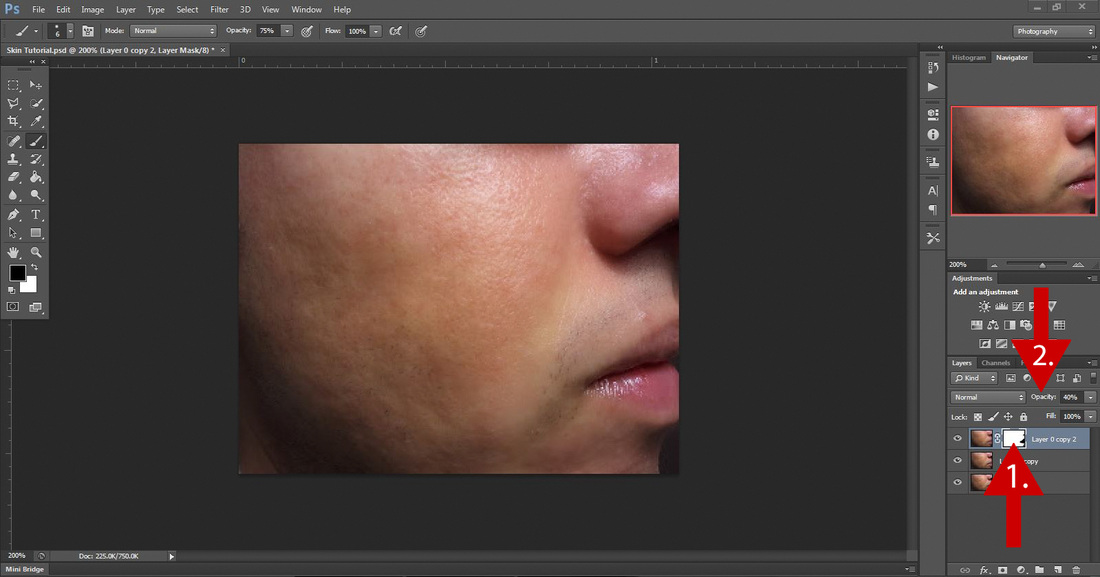
Step 2. Open up the background image you want to use. In this tutorial, I'm using the background image that my client wanted me to use for the photo composite project. Colorwise, the model and the background are completely different, but we will fix that! Make sure that the layer of the model is selected in the Layers Panel! (In this example, I labeled the layer with the model, Hades.) Next, go to the Menu Bar (see # red arrow) and select Image>Adjustments>Match Color.
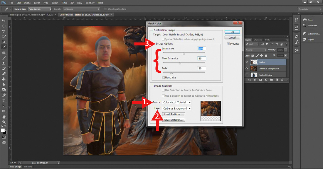
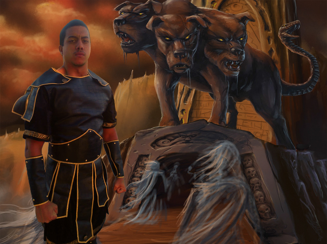
Step 3. After selecting Match Color, a dialog box will appear. Go to Source (see # 1 red arrow) and select the photoshop document that you are working on. In this example, I named the photoshop document, Color Match Tutorial. Next, go to Layer (see #2 red arrow) and select the background image. In this example, I named the background layer, Cerberus Background. After completing these steps, the model should match the color scheme of the background. As you can see, the model does not have the blue color cast anymore and the colors are much warmer.
Even though this technique works very well at matching the color scheme between two different images, the image that goes through a Color Match will sometimes look a little faded, whereas some parts of the image will become highly saturated. To fix this, you will need to go to Image Options (see # 3 red arrow) and adjust the Fade, Color Integrity, and Luminance. In this example, I adjusted the Fade by moving the slider to 20 pixels. This made the image look less faded. Also, I adjusted the Color Integrity by moving the slider to 80 pixels. This corrected the overly saturated parts in the skin.
When you have finished, hit OK.
Note: Every image will be different, so you will have to use your best judgement when adjusting the sliders under Image Options.
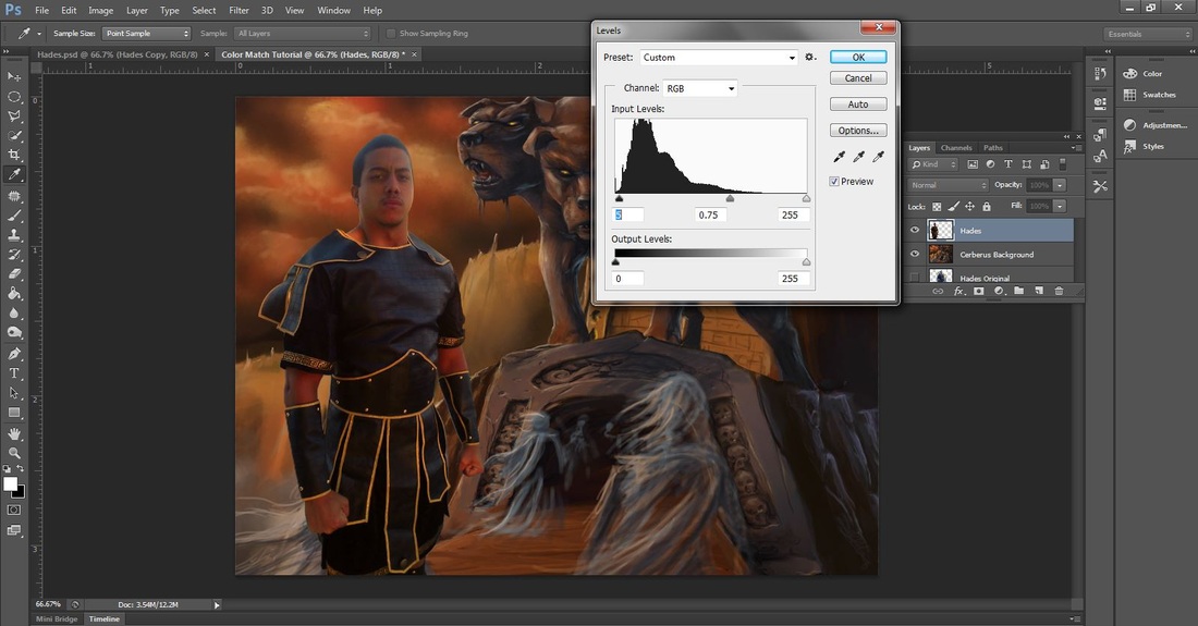
Step 4. This is an optional step. I wasn't really happy with how matching the color scheme made the model's hair and clothes look grey, so I opened up Levels (Image>Adjustments>Levels or Ctrl-L) and adjusted the sliders. Using Levels in photoshop is a really good way to adjust the tonal range of your image!
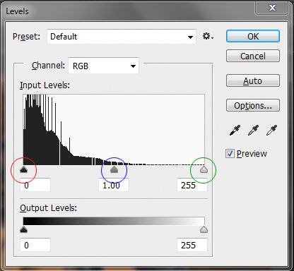
Levels: Moving the black arrow to the right darkens the image, moving the grey arrow adjusts the midtones, and moving the white arrow to the left lightens the image.
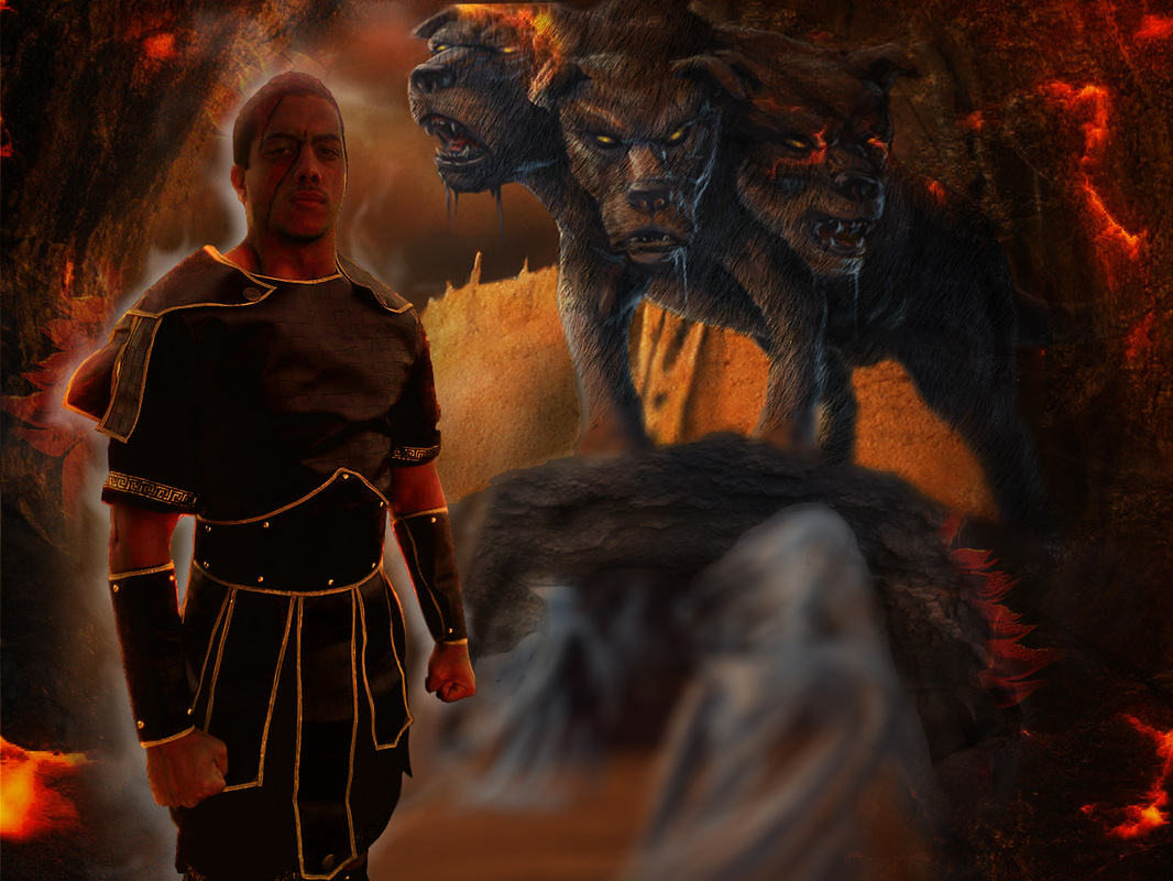
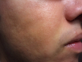
Now let's see the Before & After:
| 
|
As you can see, there is a major difference between the model in the before and after images. Just a few simple tweaks in photoshop can really enhance an image no matter the lighting conditions or color cast.
The Final Image!
After more time spent in photoshop and consulting with the client, I created an image that we were both happy with!


 RSS Feed